The Importance of Data Analytics for Decision Making How can you stay informed? Data analytics…

Mobile Friendly Website on a Budget
Website Redesign Does Not, Should Not Always Mean Replacement:
We all know how increasingly important having a mobile-friendly website has become to search engine placement, but for many reasons, a company might not be ready, or able to do a complete overhaul of an antiquated website or website design.
I am going to go over a few ways a company can hold onto the site they have (as well as a few reasons they might want to) while quickly and inexpensively bringing their site into the 2010s with mobile-friendly styling.
Common reasons not to upgrade a website:
- It is not in the budget: This might because money was already recently put into a new website design, or that the ideal and perfect website for the company will require more capital than is currently available.
- There isn’t time: Funding aside, major web development tends to require time from the client for gathering promotional literature and other collateral materials, approving designs, flow charts/site maps, discussions on what the new website should be able to do. When it comes to building a new website, some level of collaboration is necessary.
- Google and other search engines really like old sites: It is true that the older a website is, the more reliable the website appears to search, but one must also consider that regularly-updated sites are also favorable. The perfect mix, we’ve found, is having a site with an old domain, and regularly updating it.
Rome wasn’t built in a day – Good websites also take time.
The very best sites are not made in a day, or even a month – The best websites are the product of years or more of regular updates and upgrades, close attention to not creating broken links in the process, and minor design improvements made regularly. This is especially true when it comes to SEO.
Coming from an artist who has spent over 20 years as a web developer, over a decade more doing graphic design, and an entire lifetime creating fine art: There really is something to be said for works that have had a lot of time, passion, and care for detail put into them. This level of attention to detail does not happen with purchased templates, it does not come with even the largest budget for website redesign. Sure, it can begin there, but the very best websites come from many, many minor changes.
As important as it is to regularly update your CMS (content management system) software, update plugins, check your site’s and servers security, check for broken links, create new blog posts, create new pages, create other content, check directories and other inbound links – making regular minor changes to design, function, and architecture is what brings a website ever-closer to perfect.
“Minor changes”?? Making our website mobile-friendly is a huge undertaking!!
It is easy to think this. Your site might have a lot of pages… hundreds, even thousands. You might even have several different templates for several different types of pages within your site. Your site might even be built on an older/outdated CMS, a long-extinct version of one, or something completely proprietary and unsupported **
Regardless of the type of server you are running on, whether your pages are php, asp, HTML, regardless of what CMS you are using or how old your site is, the end result is that all web site pages are outputted as some sort of HTML, the language a web-browser reads to present a web page for your viewing, and all HTML is, or rather should be formatted with stylesheets – which are all some form of CSS.
Restyling/Redesigning the website to work well with mobile from here is mostly a matter of adding of taking these steps:
- Adding the viewport meta tag to the header is the first thing I do: Re sizing my browser, I can see how the site and its pages are going to look at different widths, but for a lot of mobile devices the site will not present the same without this tag, which can be easily forgotten.
- Use media queries within the css to make the web pages and their elements behave differently at different screen sizes: This is mostly a matter of making sure all elements (images, layers, paragraphs) have a max-width of 100% or less (including their margins, borders, and sometimes padding), and that their contents will not overflow those boundaries (by declaring how to treat overflow).
- Make sure things fall properly into line: Images, layers, and paragraphs ideally should, most-often each take up the full width of a mobile device. I tend to make elements expand to this size, then add “clear: both” and “float: none” to their styling.
- Make sure they fall into the proper order: Things that were floating left end up above the elements that were to their right, this is not always the best order for viewing. Sometimes element a, b, and c need to be read top-to-bottom as c, b, and a. To address this, I tend to go the Flex/ Flex-flow/Order method, but this and a number of other methods are covered in this stack overflow thread.
- Make a simple mobile menu/thumb menu: You need only use CSS to do this. A very simple drop down thumb menu can be found here, on Medialoot. Sometimes, especially if there are few pages, it is even more simple. For both Dynamic Industries (large scale machining) and Vertiflo Pump Company (vertical submersible centrifugal pumps), I didn’t even make a thumb menu – I simply made it so that menu items fell into new rows, evenly, and gave them a layered tab appearance on mobile devices.
Above (left and right) The pages of this standard HTML site were given a mobile-friendly re-design through simple CSS styling changes. A mobile menu was also added simply by re-styling the existing links/navigation
Foreseeable difficulties:
For a lot of older, really older sites, or for sites that were designed by people with limited design knowledge, or no design knowledge at all, these are some common snags run into:
- The website, site pages, or site content were created in MS Word: The result of this is a massively huge file, horribly coded, and especially badly-coded for trying to restyle with CSS. There is a large amount of proprietary code in there, and unique styles are applied to most every element, if not each and every character. There are a number of ways to clean this up, I am not going to recommend any of them in particular (but advise you try several of the free ones first).
- There is no CSS style sheet, and there are no CSS styles applied: Actually, often this is even better – it means that you will not be fighting competing style declarations and addressing most things element by element. CSS will override HTML in most cases (unless there is inline CSS). Just attach a stylesheet to the pages or template and work from there.
- There are inline styles for a number of elements or for every element: I really hate to use it, but if a very object-specific CSS declaration won’t do, you can use “!important” at the end of your declarations to override these. Use them sparingly. If all else fails, any good text editor with “find/replace” can possibly be used (locally) to remove these as you find them. If these inline styles are used within post and page content, a good find/replace plugin might be available for your CMS. If it is WordPress, I use “Better Search/Replace“.
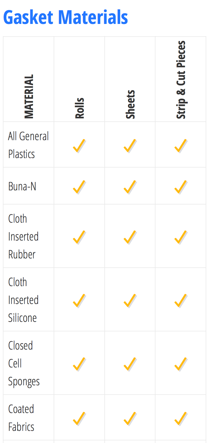
- Tables??… who still uses tables?? A decade after most designers should have stopped using them, they are still a fairly common thing. Sometimes, they are even necessary… at least until Mozilla Firefox starts handling flex correctly. Though tables are something to be avoided for layout, they are still handy as far as what they were intended for: Displaying specs and data. Generally, if tables are used to layout content, I break them apart with “display: block; overflow: hidden; float: none; clear: both;” and then work on the styling from there. Since a majority of our clients are Industrial, and more specifically: in the process industry tables filled with data are pretty common. I use CSS to break lines and to rotate the table headers at smaller sizes, like so (LEFT/top: normal website view of the table, RIGHT/bottom: Mobile website view of the table):

So… Why are we doing this again?
1. Search engines now favor mobile-friendly websites.
2. Content that is mobile-friendly reaches a wider audience/is more accessible.
3. Content that is mobile-friendly is more likely to be shared, if only because of the wider audience provided by being mobile-friendly and having better search placement.
4. It is actually not as hard as it might seem:
I know it might seem like a lot of work, all of these steps might not be necessary, and taking these steps could get help your website by in the mean time, and possibly for a while – maybe much longer if the website is regularly kept up to date with internet standards. It is also often easier, and more cost-effective to maintain a website than it is to completely replace it. Making your website mobile-friendly will put you back on the right path.
These changes, are changes that should be applied over a handful of days, and improved upon as time goes by. If you do not have a web designer who is capable of doing this in this time frame, we’d be happy to help – Just contact us.
Making a website mobile-friendly is very important in that Google and other search providers use this as a standard when giving search placement. If you also consider that an increasing amount of website visitors are using cellphones or other mobile devices, and that this portion of visitors and potential visitors is fast-becoming the majority, you know that not having a mobile-friendly site is like being on only a very small portion of the internet. It is not a very nice thing to do to yourself, your company, or all those who might wish to be connected with your product or service.
** In the latter case: Yes, I would suggest some sort of overhaul – because any CMS or plugin version even an hour old might have some exploit or other vulnerability that will end in your site being loaded with malware and pharmaceutical ads, if it is not already. I won’t go into that here, You can read more about that here, for the sake of this article I am going to assume your site is secure and sound against these things.
