Be intentional about including the following tactics in your new year marketing strategy As 2025…
Mobile-Friendly Website Design with an Image-Based Menu
When Lohre and Associates began this project, Roto-Disc, Inc. had a standard HTML web site that they liked, as much as we did, for a number of good reasons:
- It was built to reflect the look and feel of Roto-Disc‘s product catalog about as closely as could be done with a website. It matched Roto-Disc‘s catalogue so very well that the site itself felt like well-designed and well-planned literature.
- Pages were designed, not as a whole in cookie-cutter fashion, but for their purpose. Much like a printed brochure, everything was cohesively-branded as one well-collected work – yet each individual page was custom-tailored to best-present the products and services on that page.
- The existing outline was near-perfect. Divisions between pages and topics were pretty spot-on, easy to navigate and easy to follow.

It was however, as sites made years ago tend to be: static in size and format, with no mobile menus or even alternate mobile version, and no CMS or other way to dynamically-generate new content – all of which we know to be a problem today for these reasons:
- Google now gives better indexing for mobile-friendly sites, and penalizes sites that do not have mobile-friendly design or versions.
- Engineers and other decision-makers in the Process Industry cannot easily view these sites while they are out in the field, which is about the time that needs for new equipment tend to arise or happen to be revealed.
- Sites not viewed by mobile users do not get shared by mobile users, who make up for an increasingly-large percentage of internet viewers.
- Sites that are blogs, WIKIS, or otherwise CMS-driven, have a sizable SEO advantage over most sites that are not. Growing content and fostering inbound links are incredibly-important to SEO. Blogs also enable a company to position itself as an industry leader, and give them the tools to build and maintain better customer relationships.
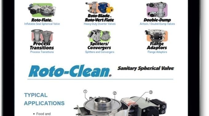
Another need to consider was that Roto-Disc‘s Product line would soon be expanding. In addition to the Heavy-Duty Spherical Valves, Lighter-Weight Spherical Valves, Sanitary Spherical valves, Inflatable Seal Spherical Valves, Heavy-Duty Clean Flow Diverters, and Airlock/Double-Dump Valves Roto-Disc already had a new section for Flange Adaptors, Wedge Inserts, and Stub Adaptors that needed to fit into the current image-based menu. Soon Roto-Disc would need to also add Process Transitions, and Splitters/Convergers, as well as the Flange Adaptors to this small swatch of internet real-estate.
From This We Created A Short List of Initial Project Goals:
- Emulate the general look and feel of Roto-Disc‘s catalog, which we had recently updated for the new product line.
- Preserve the image-based menu and allow for more menu items to be added.
- Make their site completely responsive and mobile-friendly.
- Make navigating and reading the site easy for *all* sizes: large screens, smartphones, *and* tablets.
- Build it as a CMS (WordPress in this case) for blogging, scaleable SEO, Inbound Marketing, and ease of content editing.
- Include the best SEO plugins available so that the SEO approach can be updated for new search rules and algorithms.
Which Enabled Us to Build This List of Challenges:
- The new catalog was rich with very in-depth charts for most every product. Some of these would require tables with at least 15 columns. Large tables are very difficult to display on mobile devices and harder still to display in a size and format that is easy to read and does not require scrolling or turning the device to horizontal view.
- We wanted the image-based menu to look good on desktop systems, and did not want to lose it to a simple mobile menu at tablet and mobile sizes.
- The image-based menu would require dropdowns so that viewers would have direct access to the spefic product information they were looking for.
- We needed dropdown menus to work for desktop, laptop, tablet, and smartphones. Since touch devices do not have a hover state for links, we needed to make the menu expand and contract when clicked, not moused over. This was a major consideration when it came to tablet users, because the image would present somewhat like the desktop version, but with no mouseover capabilities.
- We wanted to preserve the image menus even in the mobile version if possible.
- Having “sticky” always-on-top navigation is always nice when it comes to desktops and laptops – We wanted to find a way to do this for both the header and standard navigation, as well as the image navigation. We wanted to do this without these items completely consuming the available viewport. We also wanted the sticky image menu to not be sticky on tablets because of limited space.
- For tablet users who would lose this sticky navigation, we needed alternatives, such as an easy way to return to the navigation and/or adding navigation also to the footer of the pages.
Our Solutions:

Wide-open: The site design is based on the Brochure, but made for web, driven by WordPress, with an image menu plugin for ease of editing the image-based menu.

An Additional Consideration: For Desktop users, the image links display an instruction when moused over, letting them know that clicking will open and close the submenu (though the submenu will go also away on its own when no longer in focus).

The benefits of using a plugin and not hard-coding this aspect: All of the above menu and Submenu items can be added, removed, or edited through the control panel.

Two Sticky Menus in motion: The Image menu slides up onto the header when the page is scrolled, and stays – leaving the most important items of both sets of navigation always at the top of the screen for easy access.

Not so sticky: On smaller-sized screens not quite small-enough for the mobile menu the image menu items switch size to fall into three rows of three icons. The menu no longer sticks at the top so that content can be seen when scrolling.

Large Tables: These charts do not seem like they will fit well on a smaller screen… especially not on mobile, not even in landscape aspect. What can be done?

AHA! Jquery to the rescue: By rotating the table header text 90% and re-scaling those cells accordingly, we have a LOT more space to work with when presenting these tables on mobile devices. No scrolling necessary. Some strategic line-breaking in the product number column and Viola!

The Mobile Menu: It seems as though the image menu has been lost… and that would be sad. … but we can do better!

Huzzah!: There is that image menu again, not lost afterall.

The “Open/Close” Instructions: They are pointless here, because you cannot mouseover on a tablet or other mobile device, but they won’t be seen for this reason. Plus: They are still handy if you like keeping your browser window very small.

Tricky: Submenus on an image menu in a mobile menu. I can’t think of any place I have seen this before – actually *many* aspects of this project were something completely new.

Falling in line: Divs and most tables break apart – images set themselves to fill the viewport, and horizontal content becomes vertical in order to keep images large enough to view, also keeping text from being crammed awkwardly on the smaller screen.
Below: You’ll notice the menu does not stick to the top in mobile view. Sticky menus on mobile, especially for sites with many pages, are not a good idea. If the menu extends beyond the viewport, and does not scroll – then the only part of the menu that can be accessed is the part at the top of the screen. This will leave visitors stuck and incredibly frustrated. You can in some cases make another scrollbar just for the navigation, but if it is not seen visitors will think they have arrived at a broken site and move on.

Related Posts